
Shape
Skip support for SwiftUI.Shape ↗ on Android. Consult the SkipUI module for a complete list of supported SwiftUI.
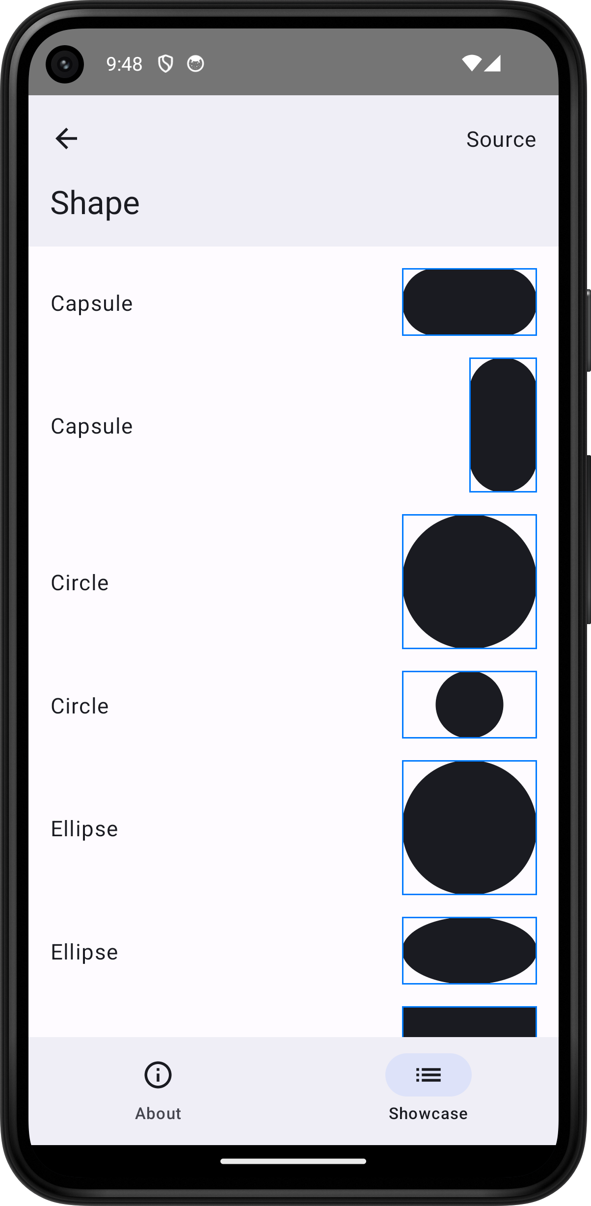
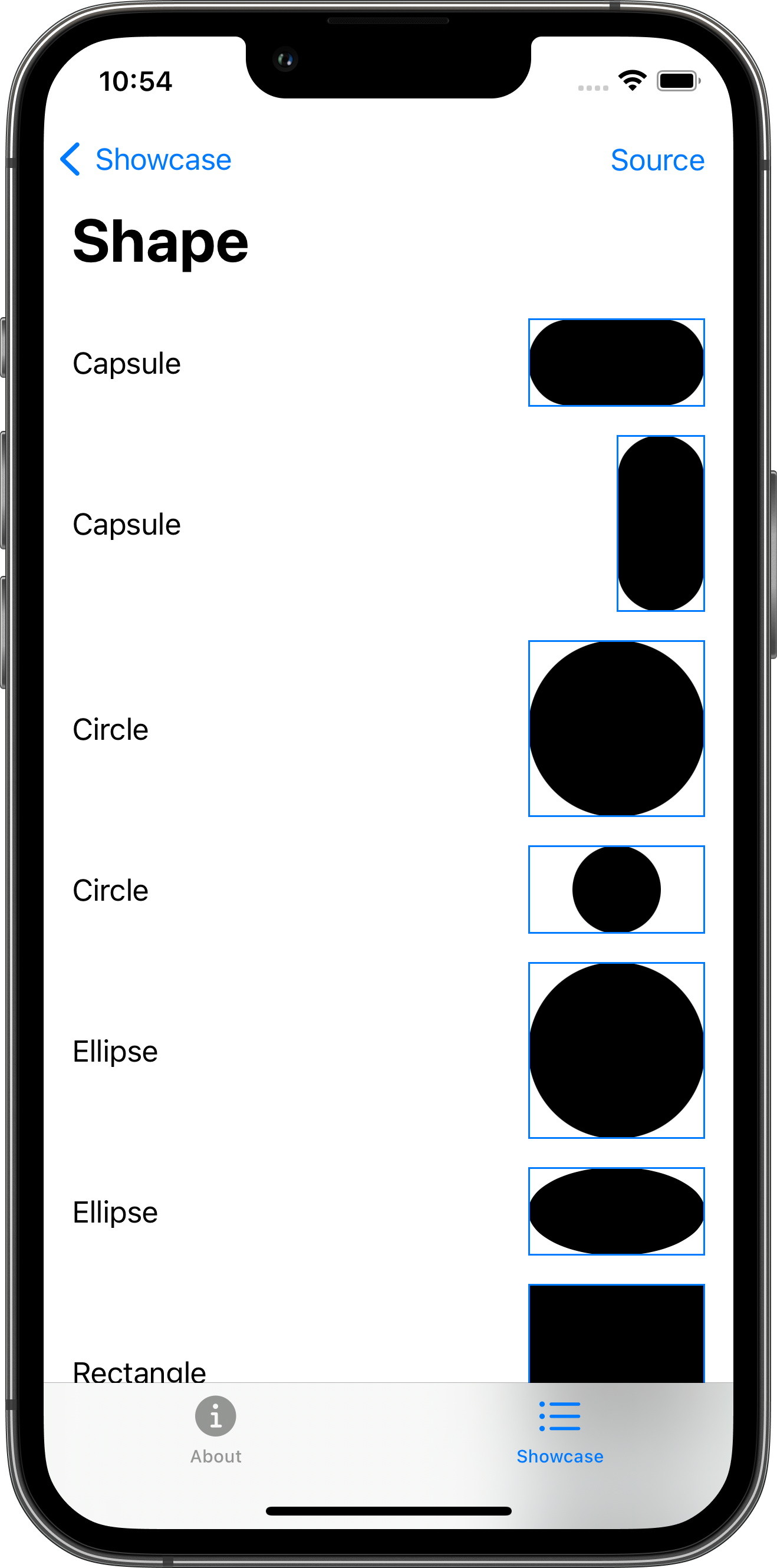
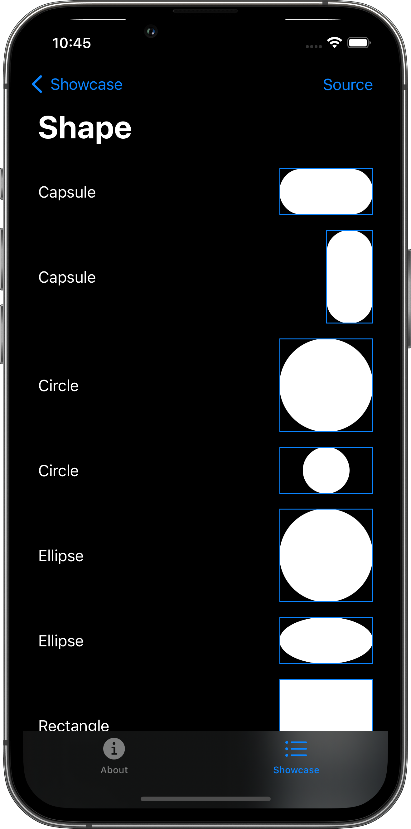
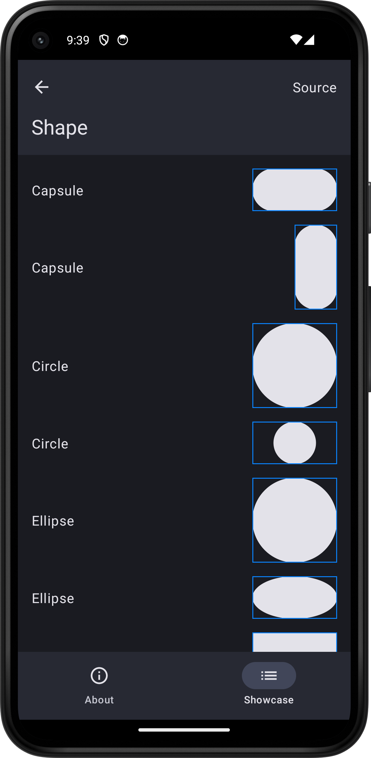
The following example screens and source code is from SkipUI’s
Showcase sample app
ShapePlayground.swift ↗
import SwiftUI
struct ShapePlayground: View { var body: some View { ScrollView { VStack(spacing: 16.0) { HStack { Text("Capsule") Spacer() ZStack { Capsule() .fill() } .frame(width: 100.0, height: 50.0) .border(.blue) } HStack { Text("Capsule") Spacer() ZStack { Capsule() .fill() } .frame(width: 50.0, height: 100.0) .border(.blue) } HStack { Text("Circle") Spacer() ZStack { Circle() .fill() } .frame(width: 100.0, height: 100.0) .border(.blue) } HStack { Text("Circle") Spacer() ZStack { Circle() .fill() } .frame(width: 100.0, height: 50.0) .border(.blue) } HStack { Text("Ellipse") Spacer() ZStack { Ellipse() .fill() } .frame(width: 100.0, height: 100.0) .border(.blue) } HStack { Text("Ellipse") Spacer() ZStack { Ellipse() .fill() } .frame(width: 100.0, height: 50.0) .border(.blue) } HStack { Text("Rectangle") Spacer() ZStack { Rectangle() .fill() } .frame(width: 100.0, height: 100.0) .border(.blue) } HStack { Text("Rectangle") Spacer() ZStack { Rectangle() .fill() } .frame(width: 100.0, height: 50.0) .border(.blue) } HStack { Text("RoundedRectangle") Spacer() ZStack { RoundedRectangle(cornerRadius: 40.0) .fill() } .frame(width: 100.0, height: 100.0) .border(.blue) } HStack { Text("RoundedRectangle") Spacer() ZStack { RoundedRectangle(cornerSize: CGSize(width: 40.0, height: 20.0)) .fill() } .frame(width: 100.0, height: 50.0) .border(.blue) } HStack { Text("UnevenRoundedRectangle") Spacer() ZStack { UnevenRoundedRectangle(topLeadingRadius: 10.0, bottomLeadingRadius: 20.0, bottomTrailingRadius: 30.0, topTrailingRadius: 40.0) .fill() } .frame(width: 100.0, height: 100.0) .border(.blue) } Text("Custom").font(.title).bold() HStack { Text("Fill") Spacer() ZStack { CustomShape() } .frame(width: 100.0, height: 100.0) .border(.blue) } HStack { Text("Stroke") Spacer() ZStack { CustomShape() .stroke(lineWidth: 10.0) } .frame(width: 100.0, height: 100.0) .border(.blue) } HStack { Text("Rotation") Spacer() ZStack { customPath(in: CGSize(width: 100.0, height: 100.0), transform: CGAffineTransform(rotationAngle: Angle(degrees: 30.0).radians)) } .frame(width: 100.0, height: 100.0) .border(.blue) } Text("Fill & Stroke").font(.title).bold() HStack { Text("fill(.red)") Spacer() ZStack { Circle() .fill(.red) } .frame(width: 100.0, height: 100.0) .border(.blue) } HStack { Text("fill(.red.gradient)") Spacer() ZStack { Circle() .fill(.red.gradient) } .frame(width: 100.0, height: 100.0) .border(.blue) } HStack { Text("stroke()") Spacer() ZStack { Circle() .stroke() } .frame(width: 100.0, height: 100.0) .border(.blue) } HStack { Text("stroke(.red, lineWidth: 10)") Spacer() ZStack { Circle() .stroke(.red, lineWidth: 10.0) } .frame(width: 100.0, height: 100.0) .border(.blue) } HStack { Text("stroke(.red.gradient, lineWidth: 10)") Spacer() ZStack { Circle() .stroke(.red.gradient, style: StrokeStyle(lineWidth: 10.0)) } .frame(width: 100.0, height: 100.0) .border(.blue) } HStack { Text("stroke(.red,\n style: StrokeStyle(\n lineWidth: 10.0,\n dash: [10]))") Spacer() ZStack { Circle() .stroke(.red, style: StrokeStyle(lineWidth: 10.0, dash: [10.0])) } .frame(width: 100.0, height: 100.0) .border(.blue) } HStack { Text("strokeBorder(.red, lineWidth: 10)") Spacer() ZStack { Circle() .strokeBorder(.red, lineWidth: 10.0) } .frame(width: 100.0, height: 100.0) .border(.blue) } HStack { Text("fill(.red)\n .stroke(.green, lineWidth: 10)") Spacer() ZStack { if #available(iOS 17, macOS 14, *) { Circle() .fill(.red) .stroke(.green, lineWidth: 10.0) } } .frame(width: 100.0, height: 100.0) .border(.blue) } HStack { Text("stroke x2") Spacer() ZStack { if #available(iOS 17, macOS 14, *) { Circle() .stroke(.red, lineWidth: 10.0) .stroke(.green, lineWidth: 5.0) } } .frame(width: 100.0, height: 100.0) .border(.blue) } Text("Transforms").font(.title).bold() HStack { Text("inset(by: 10)") Spacer() ZStack { Rectangle() .inset(by: 10.0) .fill() } .frame(width: 100.0, height: 100.0) .border(.blue) } HStack { Text("offset(x: 30, y: 10)") Spacer() ZStack { Rectangle() .offset(x: 30.0, y: 10.0) .fill() } .frame(width: 100.0, height: 100.0) .border(.blue) } HStack { Text("rotation(Angle(degrees: 45))") Spacer() ZStack { Rectangle() .rotation(Angle(degrees: -30.0)) .fill() } .frame(width: 100.0, height: 100.0) .border(.blue) } HStack { Text("scale(x: 0.5, y: 1.2)") Spacer() ZStack { Rectangle() .scale(x: 0.5, y: 1.2) .fill() } .frame(width: 100.0, height: 100.0) .border(.blue) } HStack { Text("scale(x: 1.0, y: -1.0)") Spacer() ZStack { UnevenRoundedRectangle(topLeadingRadius: 10.0, bottomLeadingRadius: 20.0, bottomTrailingRadius: 30.0, topTrailingRadius: 40.0) .scale(x: 1.0, y: -1.0) .fill() } .frame(width: 100.0, height: 100.0) .border(.blue) } HStack { Text("scale, rotate, offset, stroke") Spacer() ZStack { Rectangle() .scale(x: 0.5, y: 1.2) .rotation(Angle(degrees: -30.0)) .offset(x: 30.0, y: 10.0) .stroke(.red, lineWidth: 10.0) } .frame(width: 100.0, height: 100.0) .border(.blue) } }.padding() } .toolbar { PlaygroundSourceLink(file: "ShapePlayground.swift") } }}
struct CustomShape: Shape { let arcSize = 20.0
func path(in rect: CGRect) -> Path { var path = Path() path.move(to: CGPoint(x: rect.minX, y: rect.minY + arcSize)) path.addLine(to: CGPoint(x: rect.maxX - arcSize - arcSize * 2, y: rect.minY + arcSize)) path.addRelativeArc(center: CGPoint(x: rect.maxX - arcSize - arcSize, y: rect.minY + arcSize), radius: arcSize, startAngle: Angle(degrees: -180.0), delta: Angle(degrees: 180.0)) path.addArc(center: CGPoint(x: rect.maxX - arcSize, y: rect.minY + arcSize + arcSize), radius: arcSize, startAngle: Angle(degrees: -90.0), endAngle: Angle(degrees: 90.0), clockwise: false) path.addLine(to: CGPoint(x: rect.minX, y: rect.maxY)) return path }}
func customPath(in size: CGSize, transform: CGAffineTransform) -> Path { var path = Path() let rect = CGRect(origin: .zero, size: size).insetBy(dx: 20.0, dy: 0.0) path.addRect(rect, transform: transform) return path}