
Background
Skip support for SwiftUI.View.background ↗ on Android. Consult the SkipUI module for a complete list of supported SwiftUI.
The following example screens and source code is from SkipUI’s
Showcase sample app
BackgroundPlayground.swift ↗
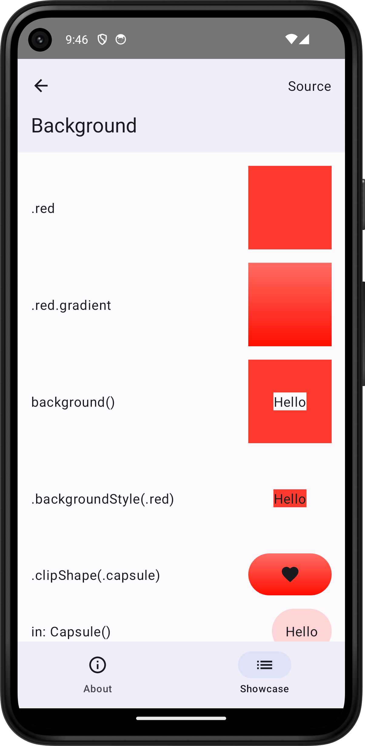
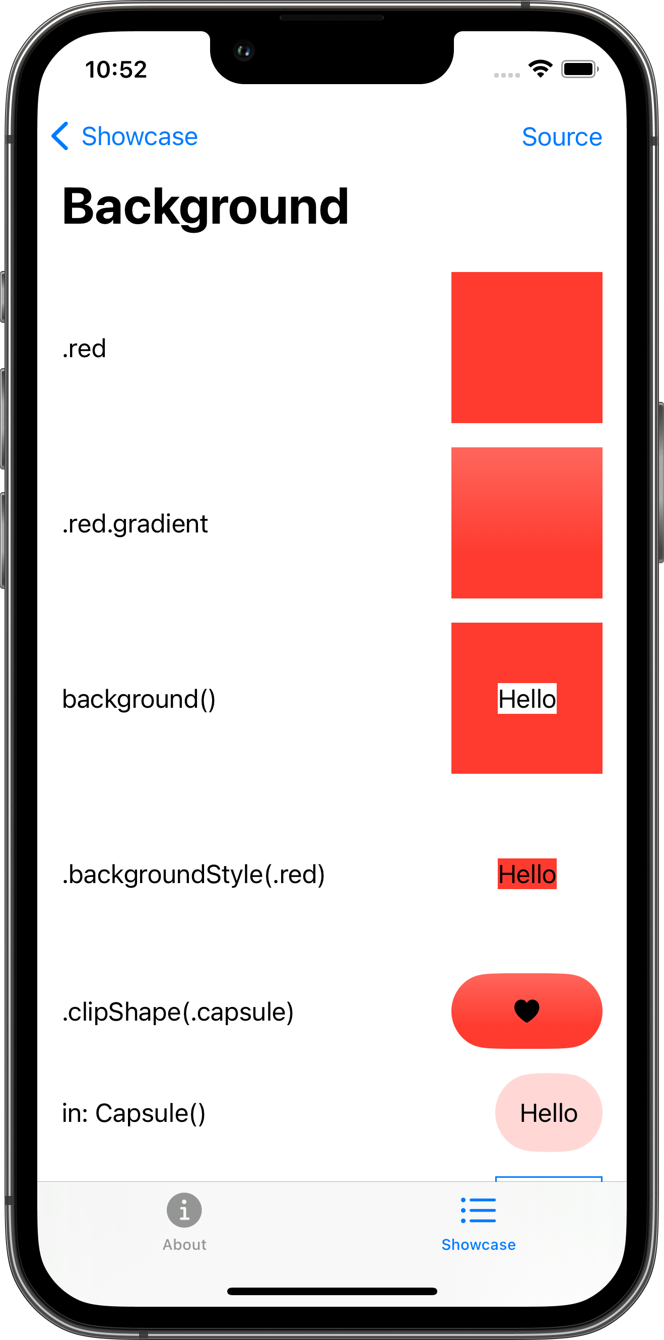


import SwiftUI
struct BackgroundPlayground: View {    var body: some View {        ScrollView {            VStack(spacing: 16.0) {                HStack {                    Text(".red")                    Spacer()                    ZStack {                    }                    .frame(width: 100.0, height: 100.0)                    .background(.red)                }                HStack {                    Text(".red.gradient")                    Spacer()                    ZStack {                    }                    .frame(width: 100.0, height: 100.0)                    .background(.red.gradient)                }                HStack {                    Text("background()")                    Spacer()                    ZStack {                        Text("Hello")                            .background()                    }                    .frame(width: 100.0, height: 100.0)                    .background(.red)                }                HStack {                    Text(".backgroundStyle(.red)")                    Spacer()                    ZStack {                        Text("Hello")                            .background()                    }                    .frame(width: 100.0, height: 100.0)                    .backgroundStyle(.red)                }                HStack {                    Text(".clipShape(.capsule)")                    Spacer()                    Image(systemName: "heart.fill")                        .frame(width: 100.0, height: 50.0)                        .background(.red.gradient)                        .clipShape(.capsule)                }                HStack {                    Text("in: Capsule()")                    Spacer()                    Text("Hello")                        .padding()                        .background(.red.opacity(0.2), in: Capsule())                }                HStack {                    Text("Circles")                    Spacer()                    Text("Hello")                        .padding()                        .background {                            HStack {                                Circle().fill(.red.opacity(0.2))                                Circle().fill(.green.opacity(0.2))                            }                        }                        .border(.blue)                }                HStack {                    Text("Large circle")                    Spacer()                    Text("Hello")                        .padding()                        .background {                            Circle()                                .fill(.red.opacity(0.2))                                .frame(width: 100.0, height: 100.0)                        }                        .border(.blue)                }                HStack {                    Text(".clipped()")                    Spacer()                    Text("Hello")                        .padding()                        .background {                            HStack {                                Circle().fill(.red.opacity(0.2))                                Circle().fill(.red.opacity(0.2))                            }                            .frame(width: 200.0, height: 100.0)                        }                        .clipped()                        .border(.blue)                }                HStack {                    Text("Small circle")                    Spacer()                    Text("Hello")                        .padding()                        .background {                            Circle()                                .fill(.red.opacity(0.2))                                .frame(width: 20.0, height: 20.0)                        }                        .border(.blue)                }                HStack {                    Text("alignment: .topLeading")                    Spacer()                    Text("Hello")                        .padding()                        .background(alignment: .topLeading) {                            Circle()                                .fill(.red.opacity(0.2))                                .frame(width: 20.0, height: 20.0)                        }                        .border(.blue)                }                HStack {                    Text("alignment: .bottomTrailing")                    Spacer()                    Text("Hello")                        .padding()                        .background(alignment: .bottomTrailing) {                            Circle()                                .fill(.red.opacity(0.2))                                .frame(width: 20.0, height: 20.0)                        }                        .border(.blue)                }            }            .padding()        }        .toolbar {            PlaygroundSourceLink(file: "BackgroundPlayground.swift")        }    }}