
Color
Skip support for SwiftUI.Color ↗ on Android. Consult the SkipUI module for a complete list of supported SwiftUI.
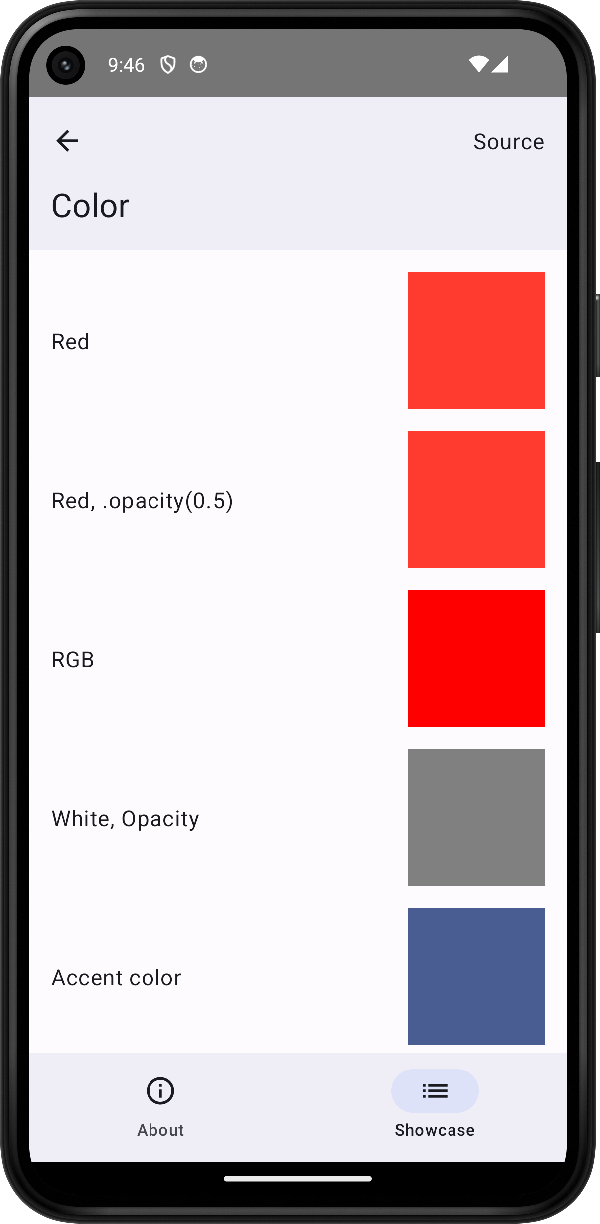
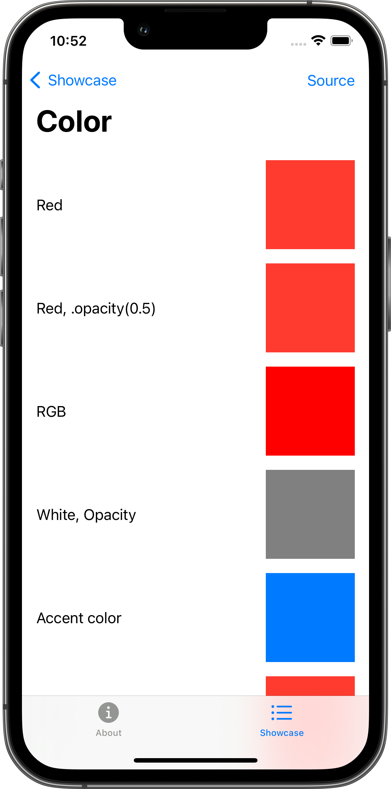
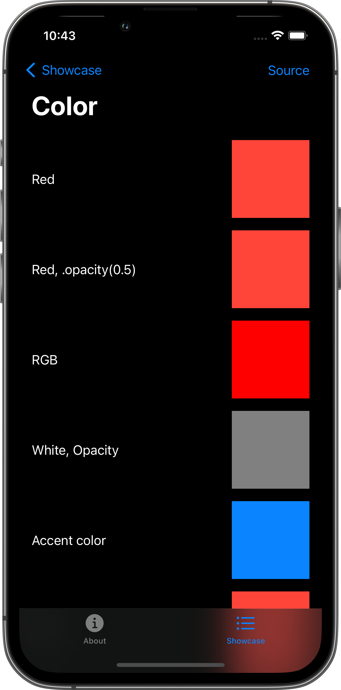
The following example screens and source code is from SkipUI’s
Showcase sample app
ColorPlayground.swift ↗

import SwiftUI
struct ColorPlayground: View {    var body: some View {        ScrollView {            VStack(spacing: 16.0) {                colorRow(label: Text("Red"), color: .red)                colorRow(label: Text("Red, .opacity(0.5)"), color: Color.red)                colorRow(label: Text("RGB"), color: Color(red: 1.0, green: 0.0, blue: 0.0))                colorRow(label: Text("White, Opacity"), color: Color(white: 0.5, opacity: 1.0))                colorRow(label: Text("Accent color"), color: .accentColor)                colorRow(label: Text("Red"), color: .red)                colorRow(label: Text("Orange"), color: .orange)                colorRow(label: Text("Yellow"), color: .yellow)                colorRow(label: Text("Green"), color: .green)                colorRow(label: Text("Mint"), color: .mint)                colorRow(label: Text("Teal"), color: .teal)                colorRow(label: Text("Cyan"), color: .cyan)                colorRow(label: Text("Blue"), color: .blue)                colorRow(label: Text("Indigo"), color: .indigo)                colorRow(label: Text("Purple"), color: .purple)                colorRow(label: Text("Pink"), color: .pink)                colorRow(label: Text("Brown"), color: .brown)                colorRow(label: Text("White"), color: .white)                colorRow(label: Text("Gray"), color: .gray)                colorRow(label: Text("Black"), color: .black)                colorRow(label: Text("Clear"), color: .clear)                colorRow(label: Text("Primary"), color: .primary)                colorRow(label: Text("Secondary"), color: .secondary)            }            .padding()        }        .toolbar {            PlaygroundSourceLink(file: "ColorPlayground.swift")        }    }
    func colorRow(label: Text, color: Color) -> some View {        HStack {            label            Spacer()            color                .frame(width: 100.0, height: 100.0)        }    }}